Don’t put your Divi Footer in your Mouth
There just is no sense in building a gorgeous Divi site with a fancy header then spilling the beans on your sick dev skills actually being the power of the Divi Theme with that dead ringer of a default Divi footer. Sure it works and you can do some flimsy customization in the Theme Customizer, but where this bad boy shines is in the Divi Theme builder.
You can (and really should) use your footer to convey important details about your site, add important links, gather information, or just add some shiny bling for you designers out there.
Today you will learn how.
Let’s gooooooo…
More in this series.
Continuing our Divi Tutorial Series on making your Divi sites not look like Divi sites, we will take a look at the bottom of your Divi site…NO! Not that bottom sicko! The Divi Footer.
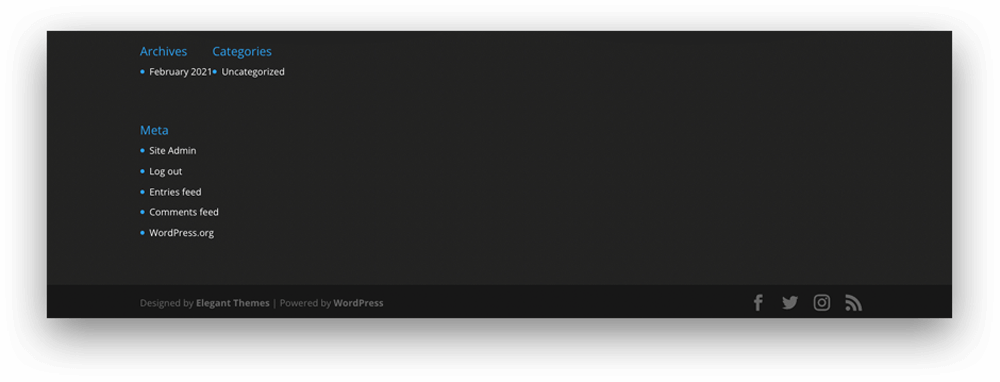
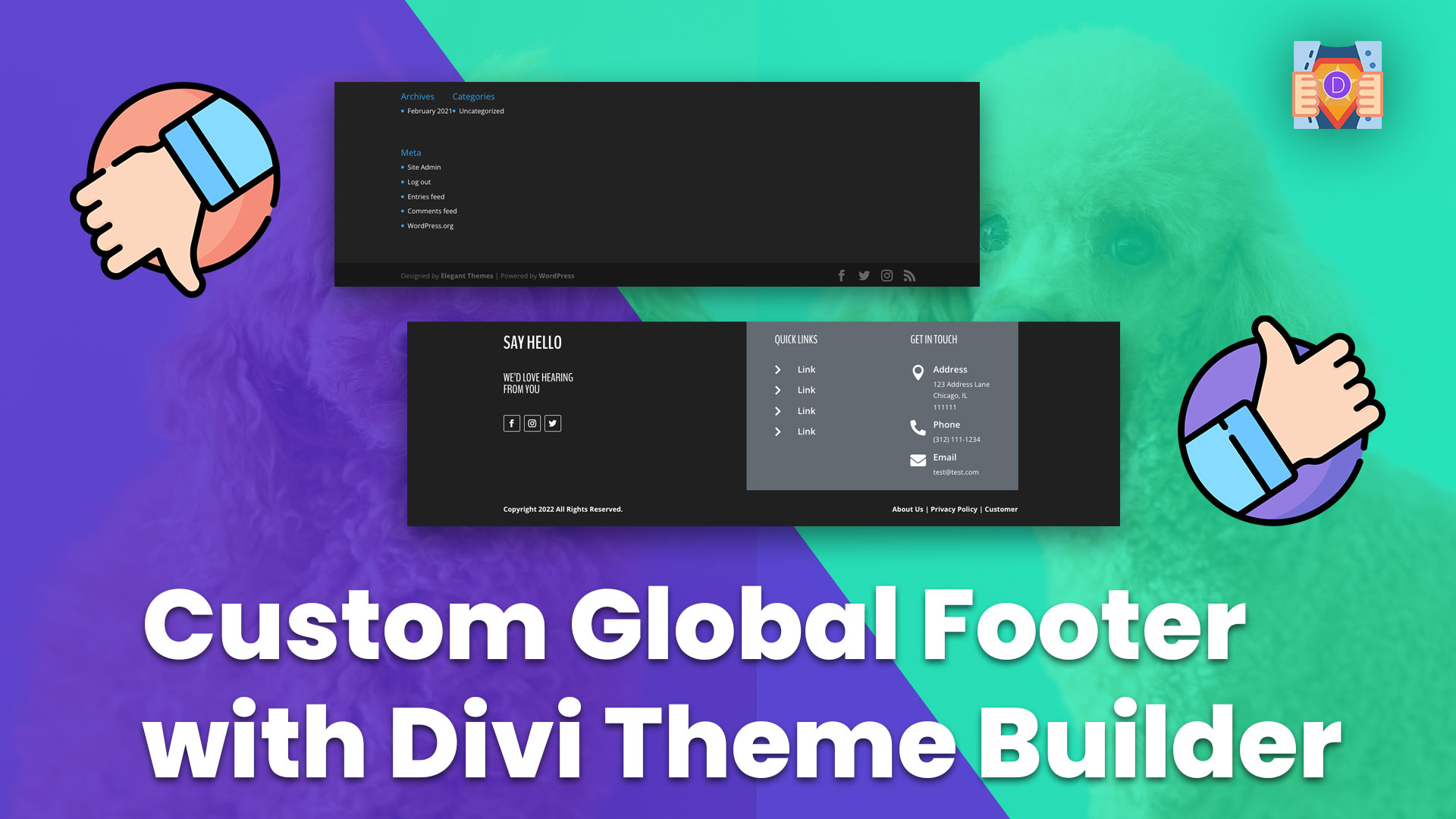
Never has there been a Divi web designer that wanted the footer on their site to say:
With its sleek archive page and category links along with some meta links, who can resist that Divi drip?
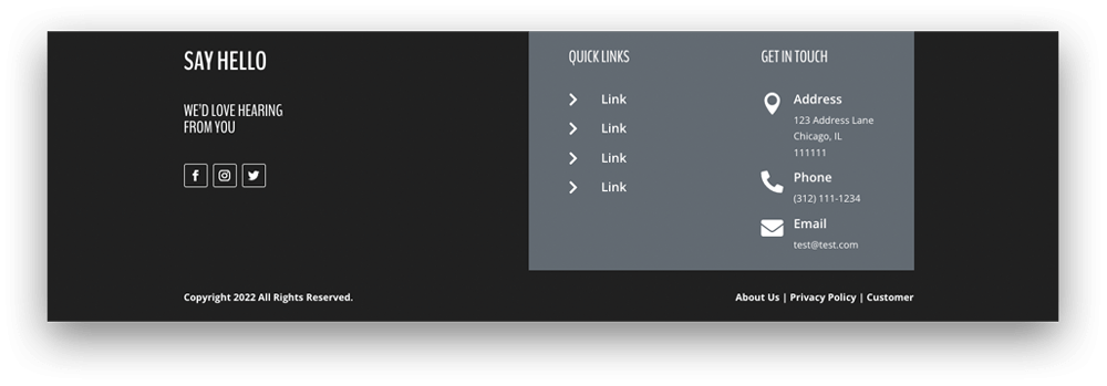
Don’t you worry, we are here to save you! Today’s Divi tutorial will take you step-by-step through building out a Global Divi Footer based on a design we found on Bēhance (← linked).
Let’s do this!
PREVIEW:
Video Tutorial
Table of Contents
Difficulty
Easy
Time
20 Minutes
Build the first row of the Divi Global Footer
Let’s start by breaking down the different elements that compose the footer on our inspiration site.
At first glance, we can see that it consists of 2 rows. One with 3 columns that contain some text with social links, quick links, and some contact information. Then one with 2 columns that contain the copyright text and some important links like the privacy policy.
Wait, Divi can do that! To build our Divi Global Footer we will need a Row with 3 columns with the first containing some Text Modules along with a Social Media Follow Module, and the second and third with Text and Blurb Modules.
Seems easy enough.
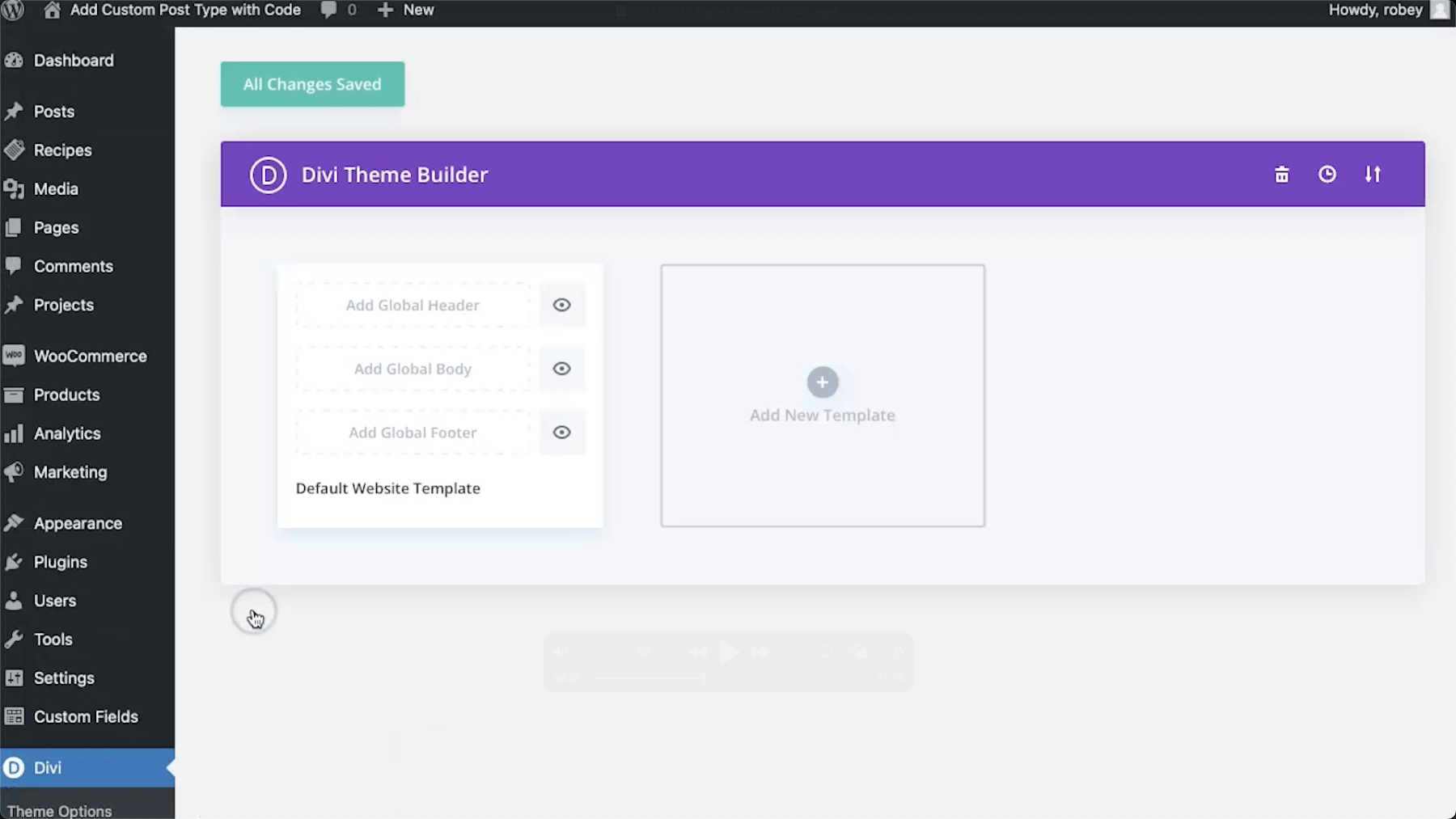
Alright, so to get going, let’s head to the following area in our Divi Install:
Divi > Divi Theme Builder
Add a New Global Footer
Add Global Header > Build Global Footer
Section Settings
CONTENT TAB
Background
Background Color: #202020
DESIGN TAB
Spacing
Padding Top/Bottom: 0px
SAVE
You’ll be greeted by the Divi Visual Builder and now we need to add the first Row that will be where the main Divi Footer content will go. We will also style our Columns.
3 Column Row (50/25/25)
3-Column Row Settings
CONTENT TAB
Background
Background Color: #626a72
DESIGN TAB
Sizing
Use Custom Gutter: YES
Gutter Width: 2
Equalize Column Heights: YES
Sizing
Padding Top/Bottom: 0
Column 1 Settings
CONTENT TAB
Background
Background Color: #202020
DESIGN TAB
Spacing
Padding Top/Left: 25px
Now, right-click the Spacing tab > Click Extend Spacing Styles > To All Columns > Throughout Row
SAVE
Time to add the Text and Social Media Follow Modules to Column 1. Remember to add in your social link URLs!
Add a couple Text Modules in Column 1
Text Module 1 Settings
CONTENT TAB
Text
Body (Text View): <h2>SAY HELLO</h2>
DESIGN TAB
Heading Text (H2)
Heading 2 Font: BenchNine
Heading 2 Font Weight: Bold
Heading 2 Text Color: White
Heading 2 Text Size: 38px
Spacing
Padding Bottom: 15px
Text Module 2 Settings
CONTENT TAB
Text
Body (Text View): <h3>WE’D LOVE HEARING<br />FROM YOU</h3>
DESIGN TAB
Heading Text (H3)
Heading 3 Font: BenchNine
Heading 3 Text Color: White
Heading 3 Text Size: 24px
Spacing
Padding Bottom: 15px
Duplicate this Text Module and place a copy in each of the other 2 columns.
SAVE
With our text for the first columns sorted, let’s get to those Social Icons for the Divi Footer.
Social Media Follow Module in Column 1 below the Text Modules.
Social Media Follow Module Settings
CONTENT TAB
Delete Twitter (We will get back to this)
DESIGN TAB
Border
Border Width: 1px
Border Color: White
CONTENT TAB
FACEBOOK SETTINGS
Link
Account Link URL: Your Social Profile URL
Background
Background Color: Transparent or delete
Save
Duplicate Facebook Twice then change the setting below in each copy.
INSTAGRAM SETTINGS (Copy 1)
Network
Social Network: Instagram
Link
Account Link URL: Your Social Profile URL
SAVE
TWITTER SETTINGS (Copy 2)
Network
Social Network: Twitter
Link
Account Link URL: Your Social Profile URL
SAVE
Phew, that was a little bit of setup, but I promise it goes nice and quick from here.
Let’s get to the second Column and add in the Quick Links to our Divi Global Footer.
Edit the Text Module in Column 2 and make the following change.
Text Module Settings
CONTENT TAB
Text
Body (Text View): <h3>QUICK LINKS</h3>
SAVE
Now we can add in a Blurb Module to house our Quick Links. We will build one, then you can replicate the Blurb for each link you’d like to add.
Add a Blurb Module in Column 2 under the Text Module.
Blurb Module Settings
CONTENT TAB
Text
Title: Text for your link
Body: Delete any text here
Image & Icon
Use Icon: YES
Icon: Find “>” or select the one you want to use
Link
Title Link URL: Add the URL for this link
DESIGN TAB
Image & Icon
Icon Color: White
Image/Icon Placement: Left
Image/Icon Width: 21px
Title Text
Title Font Weight: Semi-Bold
SAVE
With one Quick Link Blurb done, you can now duplicate this one and change the Title and Link for each copy to your needs.
And now we can wrap this Divi Footer row up with the last column that contains the contact details.
Text Module in Column 3 and make the following change.
Text Module Settings
CONTENT TAB
Text
Body (Text View): <h3>GET IN TOUCH</h3>
SAVE
Now we can add in our Blurb Modules to list the various contact methods.
Blurb Module in Column 3 under the Text Module.
Blurb Module Settings (Address)
CONTENT TAB
Text
Title: Address
Body: Your address information
Image & Icon
Use Icon: YES
Icon: Find the map pin icon or select one you want to use
Link
Title Link URL: You can add a Google Maps link if you like
DESIGN TAB
Image & Icon
Icon Color: White
Image/Icon Placement: Left
Title Text
Title Font Weight: Semi-Bold
SAVE
With the first Blurb done we can save some time by copying it twice, then changing the details below.
Blurb Module copies as follows.
Blurb Module Settings (Phone)
CONTENT TAB
Text
Title: Phone
Body: Your phone number
Image & Icon
Use Icon: YES
Icon: Find the phone icon or select one you want to use
Link
Title Link URL: You can add your phone number here preceded by “tel:” which will allow a clickable call link
SAVE
Blurb Module Settings (Email)
CONTENT TAB
Text
Title: Email
Body: Your email address
Image & Icon
Use Icon: YES
Icon: Find the email icon or select one you want to use
Link
Title Link URL: You can add your email address here preceded by “mailto:” which will allow a clickable email link
SAVE
Ok, looking good, we just need to add a little bit of CSS to finish the design.
Build the second row of the Divi Global Footer
Add a 2 Column Row (50/50) under the existing row.
2-Column Row Settings
DESIGN TAB
Sizing
Padding Left: 25px
SAVE
And for the grand finale, we will add the text to our columns.
Text Module in Column 1
Text Module Settings
CONTENT TAB
Text
Body (Text View): Copyright 2022 All Rights Reserved.
DESIGN TAB
Text
Text Font Weight: Bold
Text Color: White
SAVE
Add a Text Module in Column 2
Text Module Settings
CONTENT TAB
Text
Body (Text View): About Us | Privacy Policy | Customer
DESIGN TAB
Text
Text Font Weight: Bold
Text Color: White
Text Alignment: Right
SAVE
NOTE: Don’t forget to add your URL links to the text above.
All done! You’ve done it, go you!
Divi Global Foot(ers) giving all new meaning to High Fives!
Conclusion
All done with this Divi Tutorial on How to Build a Custom Global Footer in Divi using the Theme Builder. We again dodged the mediocrity of building just another Divi site by adding a custom global footer. The skills you learned here will serve you well in all the future projects you take.
Look at you, you Divi Pro, you.
Definitely drop a comment below to let us know what you think, and for sure share any suggestions.























0 Comments