Divi Text Module with Animated Shadow Gradient

Intermediate

CSS, HTML

Details

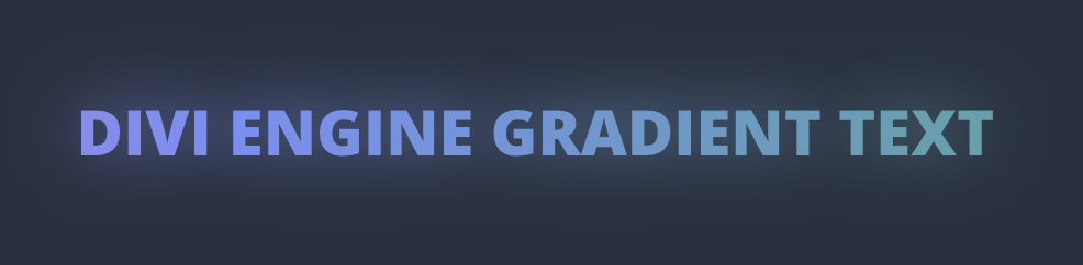
In this Divi Code Snippet, we will target the Divi Button Module to add a colorful animated gradient fill on the text, as well as an awesome gradient shadow. I am expanding on another snippet we did where we added the same effect, but not animated.

You can add the CSS in either a code module, Divi Theme Options, or the style.css of your Divi Child Theme. Once that is done, just add the de-text-gradient class to the advanced tab of your Divi Text module. You might have to play with the transform: translateY(-15%); to get the shadow in the right spot.

Snippets Demo

Animated Divi Gradient Text Shadow Snippet

Code

1

Description:
This will define the keyframes for the CSS animation.

Language: CSS

Where to add: Divi Theme Options

                        /* Defines keyframes for a gradient background animation. */
@keyframes de-gradient-animation {
    0% {
        background-position: 0% 50%; /* Start position of the gradient */
    }
    100% {
        background-position: 100% 50%; /* End position ensures the gradient sweeps across the element */
    }
}
                    
2

Description:
This will the text with a gradient color and is the class that you will be using to apply the gradient. It also assigns the keyframes we defined to this text.

Language: CSS

Where to add: Divi Theme Options

                        /* Applies an animated gradient effect to text. */
.de-text-gradient-animated {
    position: relative;
    display: inline; /* Changed to inline to better control positioning */
    color: transparent; /* Makes the text color transparent to allow the gradient to be visible */
    background-image: linear-gradient(90deg, #f687b3, #7f9cf5, #48bb78); /* Gradient colors and direction */
    background-size: 300% 300%; /* Enlarged background size to enable a visible sliding effect */
    -webkit-background-clip: text;
    background-clip: text; /* Clips the background to the text shape */
    animation: de-gradient-animation 5s linear infinite; /* Applies the defined animation to create a continuous effect */
}
                    
3

Description:
This duplicates the text and blurs it to create the colored shadow glow effect we want to achieve.

Language: CSS

Where to add: Divi Theme Options

                        /* Creates a blurred version of the animated text behind the original text. */
.de-text-gradient-animated::before {
    content: attr(data-text); /* Uses the 'data-text' attribute to duplicate content */
    position: absolute;
    top: 0; /* Aligns the blurred text to the top of the parent */
    left: 0;
    right: 0;
    transform: translateY(25%); /* Vertical offset removed for direct overlay */
    z-index: -1; /* Ensures the blur is behind the text */
    background-image: inherit; /* Inherits the gradient from the parent */
    background-size: inherit; /* Ensures identical sizing for consistent animation */
    -webkit-background-clip: text;
    background-clip: text;
    color: transparent;
    filter: blur(30px); /* Blur effect to create a soft glow */
    width: 100%;
    height: 100%;
    display: inline-block; /* Maintains block level properties while flowing like inline elements */
    font-size: inherit; /* Inherits font size from parent for consistent styling */
    line-height: inherit;
    text-align: inherit; /* Aligns text according to parent's settings */
    animation: inherit; /* Inherits animation to synchronize movements */
}
                    
4

Description:
You need to wrap your text in the Divi Text modules in a span with a data-text element which is what is used to duplicate the text for the pseudo element.

Language: HTML

Where to add: Module Content Area

                        <span class="de-text-gradient-animated" data-text="Animated Gradient">Animated Gradient</span>
                    

Explore more from Divi Engine