Introduction
We have had a few requests on how to create a mega menu like the ones on the new Elegant Themes website. It is quite simple really when you are using Divi Mega Menu, so here is a tutorial on how to do it.
You can see a live example here
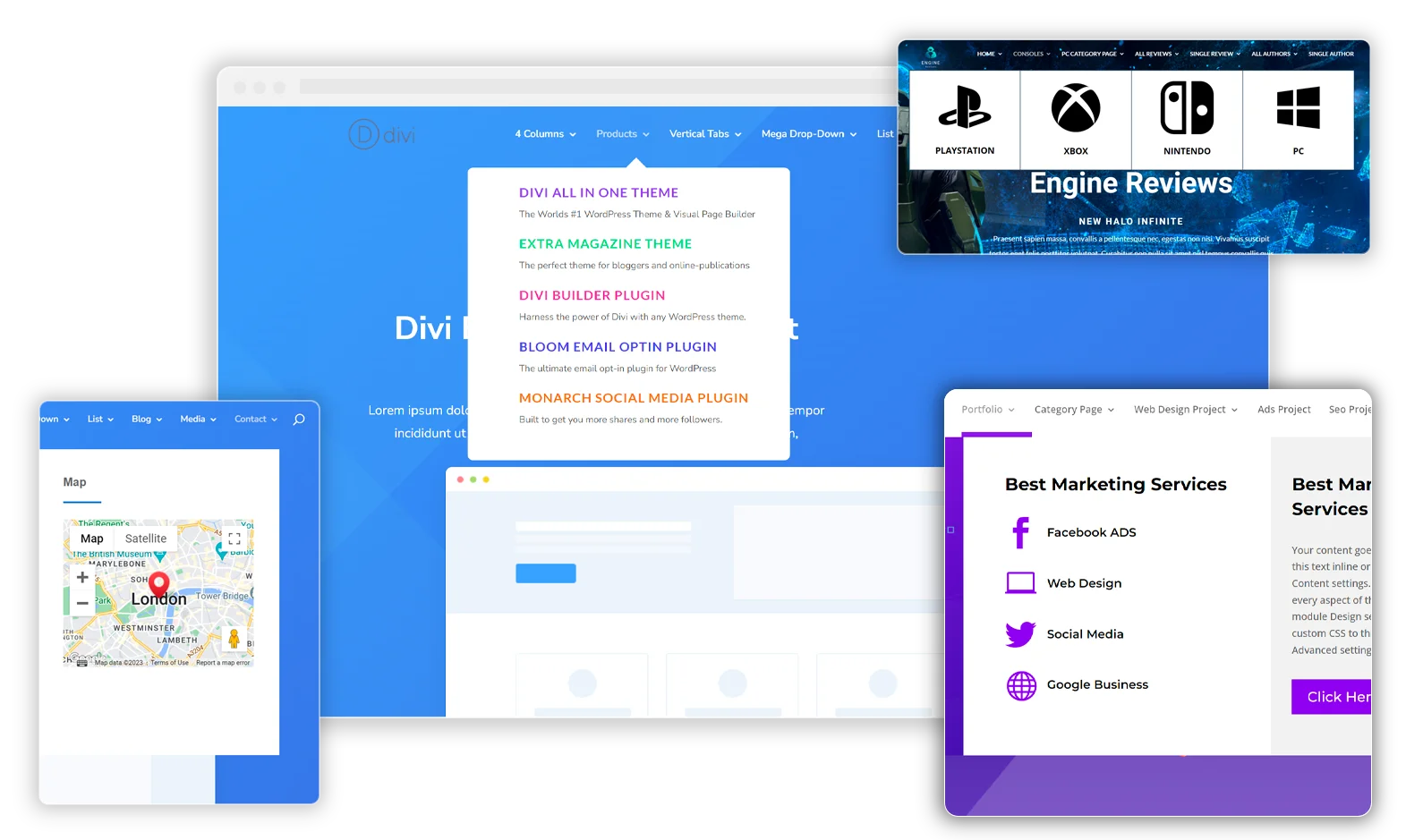
This is what we want to achieve

This is what we will make (you can style further such as fonts, adding the button at the bottom etc)
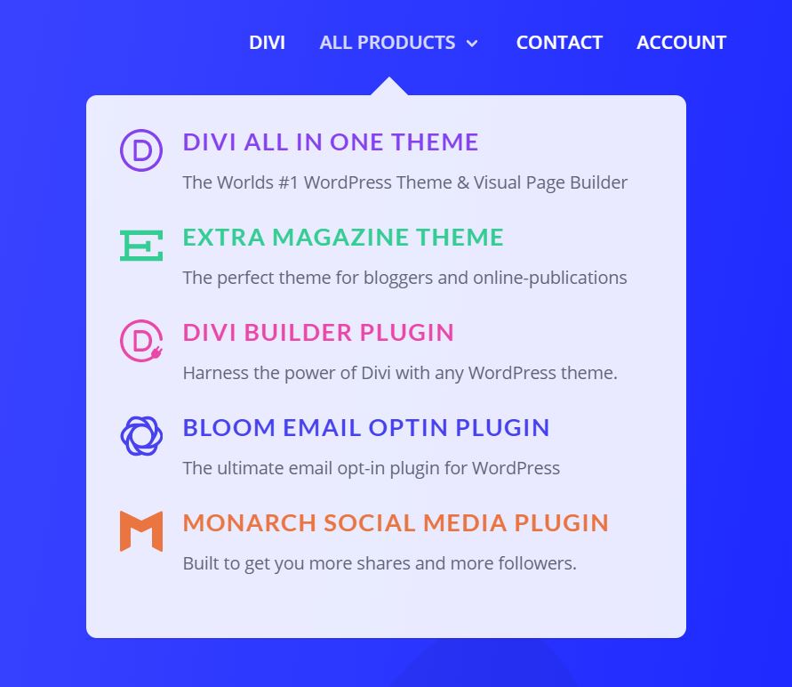
Step 1: Create your mega menu
The first thing you need to do is to go to Divi Engine > Divi Mega Menu and add a new menu and name it something like “All Products” like we have done.
Add a blurb module and in there add a title, some body text and upload an image (see image below). Then head over to the designs tab and set the image placement to be left and for it to have no animation.
Change the font settings so that it looks like the Divi site or how you want it, for this example we did the following
- Heading set to h3
- Font set to Lato
- Heading font bold
- Heading font uppercase
- Heading font color #8f42ec
- Heading font size 18px
- Heading letter spacing 1px
- Paragraph font size 13px
The final thing to do in the blurb settings is to make the whole modulue link to where ever you want it to.
On the row, go to the design tab and set the width to be 100% and the padding to be 0px for top, bottom, left and right.
On the section, go to the design tab and set the padding to be 0px for top, bottom, left and right. Set the border radius to be 8px (see image below).


Step 2: Add it to your menu
We have only added one blurb for now to test. Head over to your menu (appearance > menus) and add the unique class name to your menu item. In our case it is “all-products”
Now visit the frontend and you will see the menu item starting to take shape.

Step 3: Customise our settings
Go back to your mega menu page and set the following:
- Menu Animation: Fade In
- Animation Duration: 0.3s
- Custom Width: 450px
- Position relative to menu item? tick this box
- Adjust from left: -175px
- Triangle above menu: tick this box
- Triangle color: #ffffff
- Triangle height: 20px

Step 4: Duplicate blurbs
Now it is all ready, go and duplicate the blurbs and change the text, image and heading colour to be what you want it to be. You may want to add a button or whatever other module you want here too.
Step 5: Finishing Touches
The final thing to do now is to add some custom css to make the blurbs shift slightly to the right when you hover over them.
Add this css to your custom theme css (change #all-products to be # and what ever custom css selector you have given to the mega menu)
#all-products .et_pb_blurb{
    -webkit-transition: all 200ms ease-in-out;
    transition: all 200ms ease-in-out;
	margin-bottom: 20px;
}

#all-products .et_pb_blurb:hover{
	    -webkit-transform: translateX(5px);
    transform: translateX(5px);
}
And there you have it, simple yet effective – we hope this has helped you and got your creative juices flowing!
You can download the json layout of this mega menu layout if you want here













Once you hover and a mega menu is open, after that if you hover back up to the parent menu item, the menu doesn’t flicker and reload. How can I achieve this?
I have not checked out to make it seemless like Divi where they “merge” into the next drop down yet. We will consider looking at a solution in the future. Sorry about this.