Make Your Divi Ajax Filter Sticky on Mobile Devices

Easy

CSS

Machine, BodyCommerce, Ajax Filter

Details

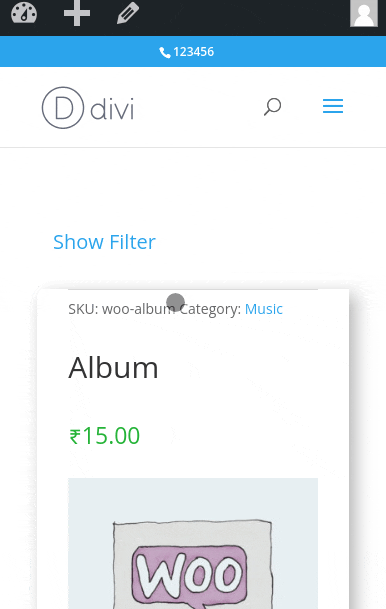
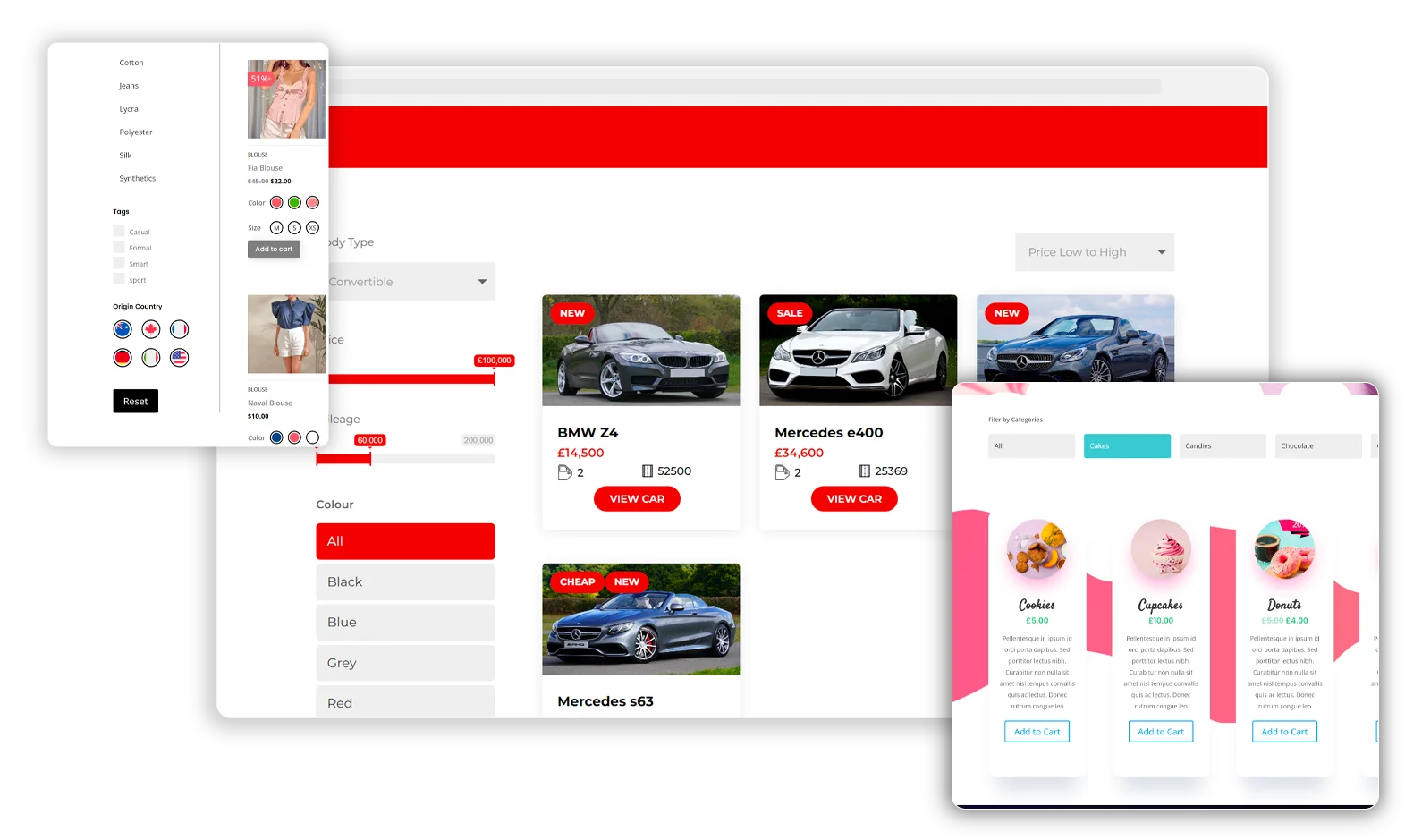
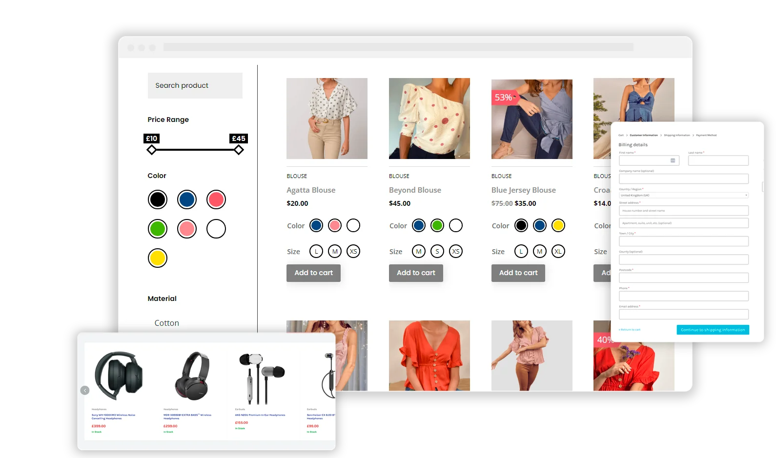
This Divi code snippet enhances the user experience on mobile devices by making the Divi Ajax Filter sticky at the top of the screen, ensuring it remains accessible as users scroll through product or archive lists. Ideal for sites using Divi Machine, Divi Ajax Filter, or Divi BodyCommerce, this CSS tweak requires adding a class (sticky-mobile-filter-container-row) to the row containing the filter.

Implementing this Divi code snippet can significantly improve navigation and usability on e-commerce sites, making it easier for customers to apply filters without needing to scroll back to the top.

Snippets Demo

Code

1

Description:
Add the class sticky-mobile-filter-container-row in the row containing the filter.

Language: CSS

Where to add: Divi Theme Options

                        /* This CSS snippet is designed for Divi Engine plugins like Divi Machine, Divi Ajax Filter, and Divi BodyCommerce. 
   It enables a sticky filter feature on mobile devices for a row with the class name 'sticky-mobile-filter-container-row'. 
   Specifically, it makes the first column of a two-column row (typically containing the filter module) sticky at the top of the viewport on mobile screens. */

@media (max-width: 980px) { /* Targets screens with a maximum width of 980px, typically tablets and mobile devices. */
    .sticky-mobile-filter-container-row .et_pb_column:first-child {
        position: -webkit-sticky; /* Ensures compatibility with Safari mobile browsers. */
        position: sticky; /* The sticky positioning keeps the element at the top of the viewport as the user scrolls. */
        top: 0; /* This value can be adjusted to change the offset from the top of the viewport. */
    }
}
                    

Related Snippets

Explore more from Divi Engine